

The site is delivered, the pages are in place, you like how it looks. From here on, what happens is no longer up to me.
After more than 250 websites, many of them for musicians, I've stopped believing that the ones that work are the best designed. They're the ones that stay alive. And the difference between a living site and a dormant one isn't the time you put into it: it's three things that need to keep moving, and one fear that blocks all three.
1. The calendar comes before everything else
If I had to pick a single page to keep current, I'd pick the concert calendar. Not for aesthetic reasons.
Someone landing on your site without knowing you — an artistic director, a colleague, somebody who heard your name mentioned — has one question in mind: where can I hear him play? The calendar is the only page that answers it. It's also the only page that, when it stands still, says something about you that no amount of text can correct: a calendar whose most recent entry is eight months old communicates inactivity, even when that's untrue.
There's a practical reason too. Concert dates are the only content on your site with a natural expiry: left alone, they only update in the wrong direction.
How to make it sustainable. Add the date as soon as it's confirmed, not once it's final. An event with venue and time still to be settled is worth more than an absent one: whoever reads it understands you're working. The details get filled in later, and changing them takes two minutes.
2. Photographs: the problem isn't having them, it's choosing
This is what keeps me waiting longest, and for years I assumed it was a matter of time. It isn't. Musicians have the photographs — often hundreds of them. What's missing is a criterion for choosing.
That makes sense. You spent twenty years refining how you play, not deciding how you present yourself. Selecting promotional material about oneself is a different craft, and nobody taught it to you.
The block comes from asking the wrong question. If you ask which photo is best, there's no way out: each one is better in some respect and worse in another. The right question is which question does this photo answer. That changes everything, because the questions are few and each one wants a single photo.
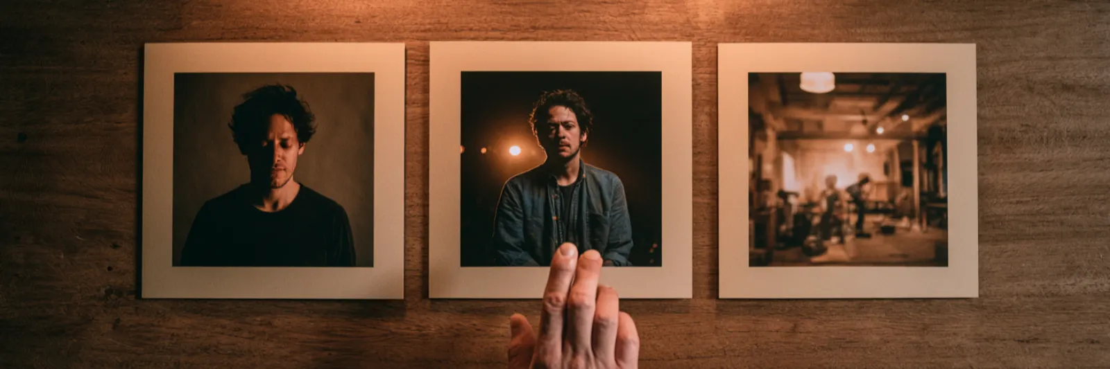
- Who you are. A portrait, eyes toward the viewer. It belongs in the biography and nowhere else.
- How you play. A concert shot, with instrument and setting visible. It belongs on the home page and in project pages.
- How you work. A photo in rehearsal, teaching, or in the recording studio. It's the rarest and the most useful, because it's the only one showing something others don't show.
Three photographs. Not thirty. And they get replaced once a year, not after every concert.
On header images. This is where clients intervene most, and they're right to. The image at the top of a section doesn't decorate: it tells the reader in what context to read what follows. The same contact page, under a rehearsal-room photo or under a photo of a full theatre, communicates two different things. So when you tell me which image you'd prefer, you're making a content decision, not an aesthetic one — and it's right that you make it.
3. Reviews: extract, don't archive
Same mechanism as the photographs, same block. You wait until you have the right review, and meanwhile the page stays empty.
A full review is almost never useful. Nobody reads to the end, and the best part is nearly always a single sentence buried in the third paragraph. Pull that sentence out and publish it with the publication, the byline and the date. Leave the rest where it is: if someone wants to read it all, a link is enough.
The criterion for choosing the sentence is the one from before: take the one that says what you do, not the one that says how good you are. "An interpretation of rare intelligence" helps nobody decide. "He built the first movement as a single arc, never giving in to the temptation of effect" tells an artistic director what to expect.
The fear of getting it wrong is the real cost
Here I come to the thing that matters more than the other three combined.
Someone with little confidence around computers isn't slow because they don't know where to click. They're slow because they're afraid of breaking something, and that fear makes them reread three times, postpone, ask for confirmation before every step. An update that takes five minutes ends up filling an afternoon, and after two afternoons like that, people stop.
What I've seen over the years is that those who get past this stage manage their own site better than I would — because they know the material and the dates long before I do. The shift doesn't come from studying: it comes from doing the same operation three or four times, until it stops feeling dangerous.
Two things worth knowing before you start, because they remove most of the fear.
Nothing you do is irreversible. Every change can be undone, every text rewritten, every image replaced. There is no button that deletes the site.
You don't have to finish. You can save an incomplete date, a half-written text, a placeholder image, and come back whenever you like. The idea that an update must be done all at once is the main reason it never gets done.
The rhythm that works
Twenty minutes a month, always on the same day.
The calendar every time. Photographs twice a year. Reviews as they arrive, straight away, while the file is still open.
It isn't about discipline: twenty minutes a month is sustainable, an afternoon every so often isn't. The sites that stand still don't belong to the people with less time — they belong to the people who gave themselves too large a task.
If there's a step that keeps stopping you, write to me and we'll do it together the first time. From the second time on, you won't need me.